The Responsive Website Font Size Guidelines
https://www.learnui.design/blog/mobile-desktop-website-font-size-guidelines.html
In this post, we’ll cover what font size to use for a modern, responsive website. First, I’ll give an overview, then we’ll cover mobile guidelines and desktop guidelines in-depth.
| Element | Mobile | Desktop |
|---|---|---|
| Page title | 28-40px | 35-50px |
| Default/body text | 16-20px for text-heavy pages*, 16-18px for interaction-heavy pages* |
18-24px for text-heavy pages*, 14-20px for interaction-heavy pages* |
| Secondary text, captions | 2px smaller than default | 2px smaller than default |
Now let’s go deep on mobile font sizes 🤓
Mobile Web Typography Guidelines
Picking font sizes for a mobile site is not an exact science. Instead, I will give a few heuristics (with the underlying logic) to help you in your own design process.
1. Body fonts should be about 16-20px
First caveat: different fonts may have the same size on paper, but appear subjectively different.
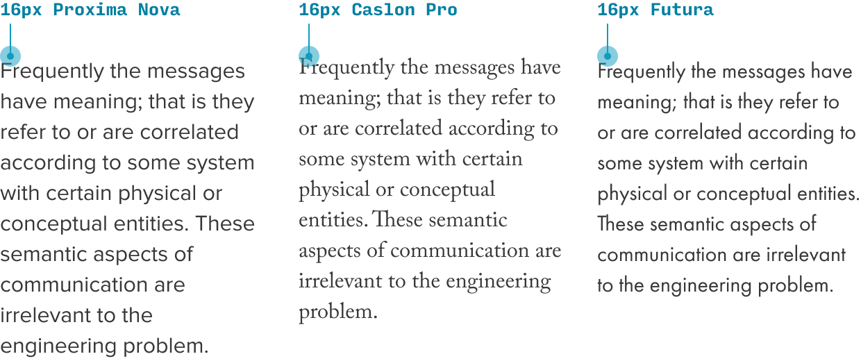
Futura is much 'smaller' than Proxima Nova, even at the same specified size
Second caveat: different sites need to optimize for different things.
So with all that in mind, the best rule of thumb: start with size 17, and adjust from there.
In particular:
- ⬇️ Adjust the size down if…
- You need to display more information in mobile widths
- There are so few words per line that it feels obnoxious to keep moving your eyes to the next line
- You have less than 30 characters per line
- ⬆️ Adjust the size up if…
- Users need to read paragraphs and paragraphs of text
- The text feels too small when you view it on mobile (it should be as easy to read as a well-printed book)
And remember, your default font size should be used as much as possible:
- Body text
- Menus
- Lists
- Form controls (probably)
- Labels (maybe)
(I’ve taught UI design to thousands of people, and one of the top mistakes is using too many font sizes. So picking a good all-rounder default font size is a huge boon to your design 👍)
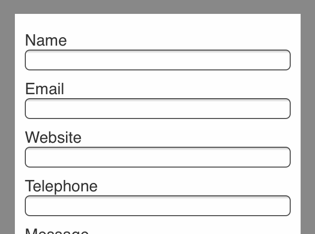
2. Text input sizes should be at least 16px
This is important. If you’re designing a website or app that can be viewed on mobile devices, there is only strict rule: Use a text input font size of at least 16px.
If your text inputs have a smaller font size than that, iOS browsers will zoom in on the left side of the text input, often obscuring the right side and forcing the user to manually zoom out after using the text box.
Video or it didn’t happen, right?:
Animation courtesy the dashing Ste Grainer. You can read his article on the auto-zoom phenomenon here.
This is a strong reason to make the body font size 16px or larger as well. It can look awkward to have larger form control text than paragraph text ☝️
3. Secondary text should be about 2 sizes smaller than your paragaph text
For secondary text – like lesser labels, captions, etc. – use a size a couple notches smaller – such as 13px or 14px.
In addition, when text is less important, you want to style it so that you’re clearly communicating the lesser importance – often using, say, a lighter shade of gray (something about 70% as strong is a good place to start). For an example of this, look at the caption above 😉
4. Always view your designs on an actual device
The gold standard of choosing mobile font sizes is to view your designs on an actual device. I can’t recommend this practice highly enough, since the feel of an mobile app design on your laptop screen is way different than when you’re holding it in your hand.
As a beginning designer, I was shocked almost every time I opened on mobile a page I designed on desktop. Font sizes, spacing… everything was off. So use the Figma iOS app or Sketch iOS app or similar for Android, but view your designs on-device.
5. Be familiar with iOS and Android standards
It never hurts to know what the biggest design systems in town are doing. For instance:
- iOS’s default font size is 17px SF Pro and secondary font size is 15px (more on iOS styling)
- Material Design’s default font size is 16px Roboto and secondary font size is 14px (more on Android styling)
Do you need to copy them? Nope – but it never hurts to have a baseline to compare to.
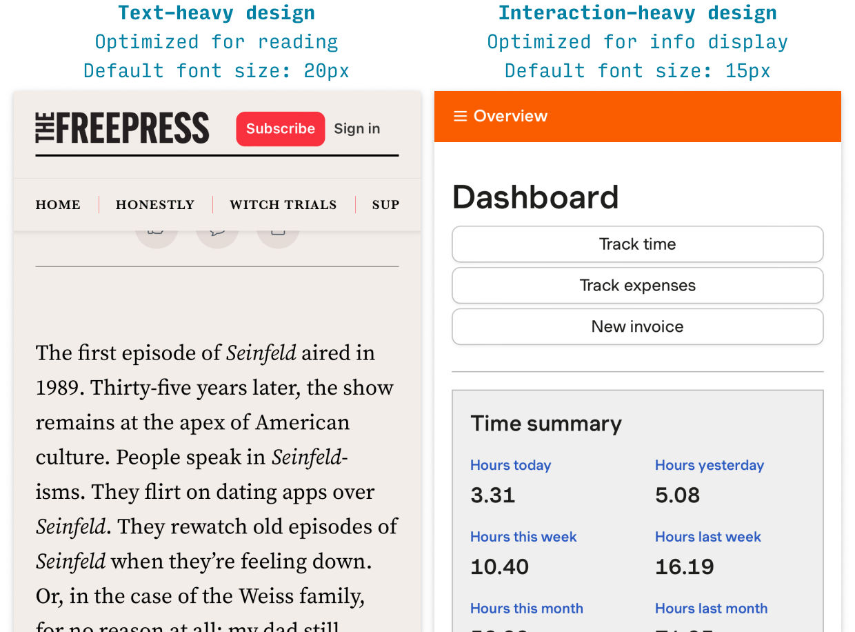
Text-Heavy vs. Interaction-Heavy Pages
Before we dive into desktop guidelines, I want to make a brief aside.
Whether you’re designing for mobile or desktop, one of the most important questions when picking font sizes is: am I working on a text-heavy or interaction-heavy design?
- Text-heavy pages. Articles, blogs, news, etc. The primary purpose is reading.
- Interaction-heavy pages. Apps, feeds, forms, lists, tables, visualizations. The primary purpose is interacting or skimming (not reading paragraphs of solid text).
A blog post is text-heavy. A contact form is interaction-heavy.
For text-heavy pages, you want to optimize the experience of reading. Is the text comfortable to read for long periods of time?
For interaction-heavy pages, you want to optimize the display of information. Can the user see all the information they need on the screen, and understand the text elements’ relation to each other?
Typically, this means that text-heavy pages end up with slightly larger font sizes than interaction-heavy pages. Why?
- Text-heavy designs are trying to make text as legible and readable as possible
- Interaction-heavy designs are trying to display information efficiently and clearly
OK, with that taken care of…
Desktop Web Typography Guidelines
Now let’s talk a little bit more about desktop websites.
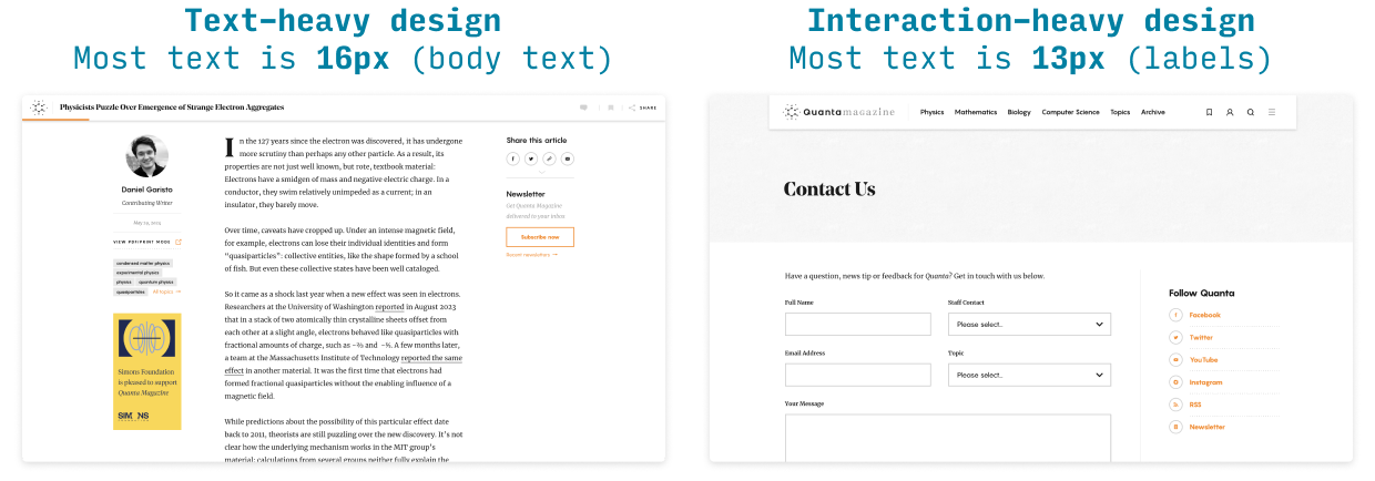
1. Use a default font size of 14-24px
As always, you want to start by knowing whether you’re designing a text-heavy or interaction-heavy page.
- For interaction-heavy designs, your main font size will be 14-20px
- For text-heavy designs, your main font size will be 18-24px
Why? Because larger fonts are easier on the eyes for longform reading (but larger than 24px can start to violate the next rule 😉)
2. Body text should have 50-75 characters per line
For text-heavy designs, if you know how large your main column of text is, that can help you figure out the best font size to use. Simply put, you want 50-75 characters per line. Why? It all has to do with “tracking from the end of one line to the beginning of the next”.
- If you have fewer than 50 characters per line, readers can spend too much time tracking and not enough time reading
- If you have more than 75 characters per line, readers can find it difficult to track from one line to the next
For more on the interplay between font size and line-height, see my Interactive Typography Tutorial.
3. Your headline can (probably) be even bigger
One very common beginner mistake I see is underemphasizing headlines.
Here’s what I recommend:
- Size. For desktop, experiment with everywhere from 30-50px.
- Weight. Use a bold (or even thicker) weight
- Font. Headers & subheads are the best place to add a second font – but make sure to pair fonts in a logical way.
4. Use as few font sizes as possible
One of the single biggest typographical mistakes from beginning UI designers is to use way too many font sizes. Even the most interaction-heavy pages can typically look just fine with about 4 font sizes total.
Let’s break it down:
- Header font size. Obvious. If you have subheaders, then fine, add that in there too 😉
- Default font size. The most common font size on your page; should be used for all body text – as well as most controls, like text boxes, dropdowns, buttons, and menus. The big mistake beginning designers make here is to use many font sizes for elements that should all be one font size.
- Secondary font size. This is a font size – usually about 2px smaller than your default font size – that you use for less-important details of the site. Supporting information, details, captions, etc.
- Tertiary/caption/label/wildcard font size. Very often you will need one more font size. Sometimes it’s because your information is so hierarchical you need a tertiary style even more subdued than the secondary style. Other times, you might use uppercase for labels or buttons – and because of the increased visual weight of the uppercase, you want to use a slightly smaller size for the text itself (remember: balance up-pop vs. down-pop). So this fourth font size is a bit of a wildcard. Not every design needs it, but many do. My only warning: as much as possible, default to consistency (no strikethrough, no crazy gradients 😛).
Alright, that wraps it up for font sizes for websites!